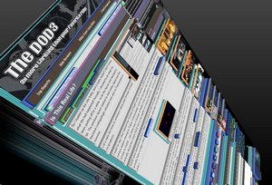
 So I loaded up the site today and it looks better! I don’t know what the hell happened! Actually, I decided to do what I’ve been putting off for a while: re-do the layout and backend a bit. The previous layout started to look pretty dated and the backend coding/plugin situation was akin to Frankenstein’s monster.
Let’s take the time to reminisce about past Domain of Death incarnations.
I want to say I first started the Domain of Death series of website in 2001 and hosted them on AOL’s web hosting service before moving to Tripod. Unfortunately I can’t find any pages from the DoD1 days. However, they looked similar to DoD2…yes there was a Domain of Death 2 that was going to launch in 2004. Revel in its awfulness. I actually found the entire DoD2 site in the depths of a backup hard drive…and my god, it is abysmal in every way.
DoD2 never launched because I didn’t know what the hell I was doing. Yeah, that basically sums it up nicely. I actually have a page called Evolution of DoD3 that elaborates much more (and pretty much covers everything in this post.)

“Scary Guy,” the mascot of Domain of Death 1. *hangs head in shame*
DoD3 launched in March of 2005 and looked like this. 2005. And it looked like that. 1995 called and wanted its web design back. I actually took the time to hunt down all of the images to give it the full on DoD3 1.0 experience. I like how the bottom clearly states: “This site was made with Page Breeze HTML Editor. It really helped a lot since I don’t know jack about HTML.” Heh…
In 2006 The DoD3 1.1 layout went live and added tables to govern everything (this is a no-no/mid-90s web design for all who don’t know) along with some needless use of Javascript. The Internet Archive has this archived and can be seen (and browsed a bit) here. In 2008 I apparently integrated WordPress, as per the first blog post ever. Internet Archive does indeed have this period archived but the styling is fubar’d.
Then was the previous layout, DoD3 1.2, which went live on January 13, 2009. Just over 4 years to the day, how about that? I even made the same corny joke in the post about it! It looked much better than the other offerings but was still kind of visually displeasing. Here’s the Internet Archive for future posterity.
Then there was DoD3 1.3. You’re looking at it! Over the coming weeks you might see some funky stuff happening as I tool around with the layout. Currently the site should look good in all the major browsers with resolutions above 1024×768. Users still stuck in the past using Internet Explorer 7 and earlier are going to be looking at a jumbled mess. I can probably fix it for IE7 but IE6 is a lost cause.

2 Comments
yay for new sexy look
Glad you like it MJ!